logo

A simple and effective website to accomplish your preaching needs.

View Website
Role:

UX Design
Visual Design

Design Deliverables:

User Surveys Personas
Hueristic Analysis
Concept
User Stories & Flows
Paper Prototype
Wireframes
User Testing
Visual Design

Tools:

Figma
Invision
Google Surveys

Duration:

4 Weeks

Overview

What does vietspc.org do?

This website allows you to stay centralized on updating information during your time volunteering in your assigned city. Learn about the weather and sample door presentations in your language. (English / Vietnamese). As an official website made available for Vietnamese preachers all around the U.S, I was focused on creating the best UX design I had ever done!

Problem


We had just about 4 weeks to launch a responsive website with content containing videos and pictures related to the Vietnamese Campaign that would be available in both Vietnamese and English translations.

Solution


Worked together as a team to prioritize workflow and progress. Generated solutions and ideas on how to organize all content required from stakeholders.

Discovery Phase

User Research

With little time to conduct user surveys determining how people used preaching websites, we conducted a few user interviews obtaining an interest in requirements the stakeholders already wanted the website to entail. This made sure the features the stakeholder wanted were also something users would find an interest and enjoy.

View User Survey

From the SUS test analysis on a scale of 1-5 of most interested in possible features such as weather, purpose/goal statement, picture gallery, time/location of meetings, sample presentations were all rated high in interest. This informed us the keep along with all features and continue on with the process.

User Personas

Biography

Levi is a barista who lives in Alabama. There he attends English congregation weekly near his house, with his parents and his two younger sisters. While being a barista, he is studying to become a medical assistant and recently started pioneering. Levi is always trying to reach out and do more in the congregation and at home. He only speaks Vietnamese at home to his parents and siblings. He helps the Vietnamese group out in service whenever he can.

Goals

- Know the exact address and time for field service in selected city
- Easily store field service time and referals anywhere
- Read about campaign experience from others participating

Frustrations

- Not confident if his vietnamese presentation is effective
- He has to travel to a place he doesn’t know much about
- Sometimes, transportion might be a problem

Motivations

Living a happy and simple life is what I value the most

Biography

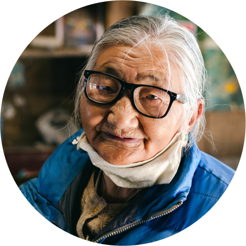
Bac Beth is retired and living in a senior home in Texas. She doesn’t drive or own a car. The congregation arranges transportation for her to attend meetings and service. She has the newest Iphone because her grandkids got a good deal with the phone company. Bac Beth has lots of experience with preaching to vietnamese people she is not shy to walk up to someone and talk to them about the good news. She oftens walks throughout the territory, she is in good health.

Goals

- Preach to vietnamese people
- Remember where to meet the friends and when
- Meet others friends from out-of-town

Frustrations

- Doesn’t know how to use her phone besides calling her kids
- Can’t read the little words on the screen
- Forgets how to navigate to wesbites on her phone

Motivations

Her grandchildren gives her joy more than anything else

Heuristic analysis

The stakeholders wanted this website to have a similar layout to jwevent.org. We took steps to conduct a simple heuristic analysis to gather important insight to continue with our designs.

Information Archiecture

User Stories and Flows

With previous research in mind, creating User stories eases the start for designing paths for adding content such as, submitting follow-up forms, clicking to read about your location, practicing your presentations.

As a new user

I want to know the purpose of campaign

As a new user

I want to read about my city

As a new user

I want to find my kingdom hall location and times

As a new user

I want to see videos and pictures

As a new user

I want to learn presentations

As all users

I want to submit transportation forms

As all users

I want to sumbit follow-up forms

As all users

I want to submit my experiences

As all users

I want to replay presentation vidoes

As all users

I want to read the script of the presentation videos

As all users

I want to see webiste in english and vietnamese

As all users

I want to campaign statistics

As all users

I want to read about updating information

View User Flows

Paper and Wireframes

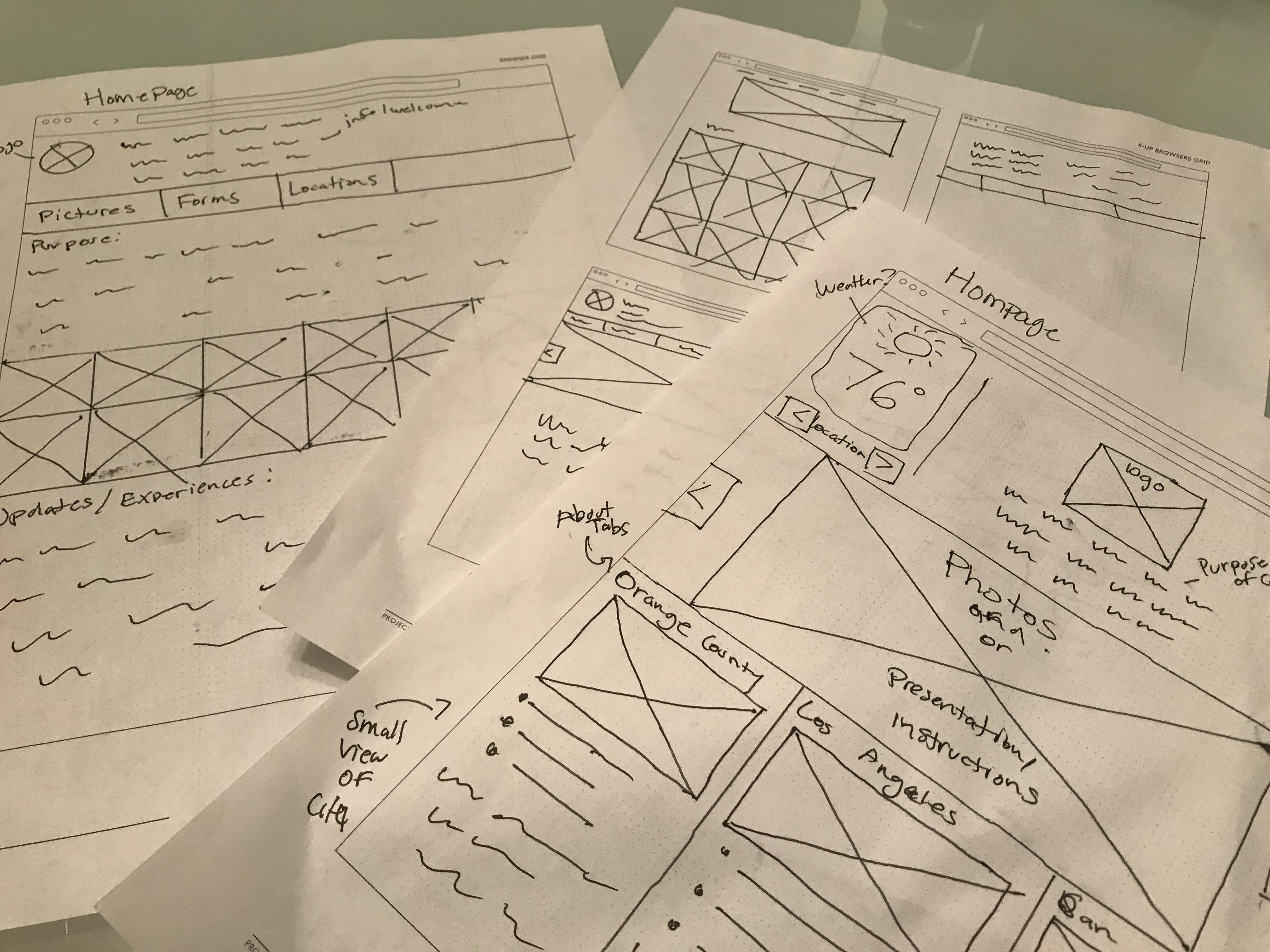
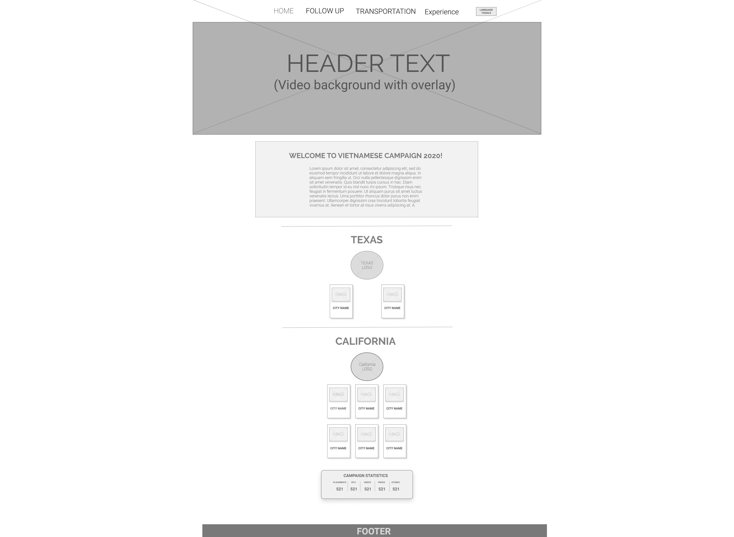
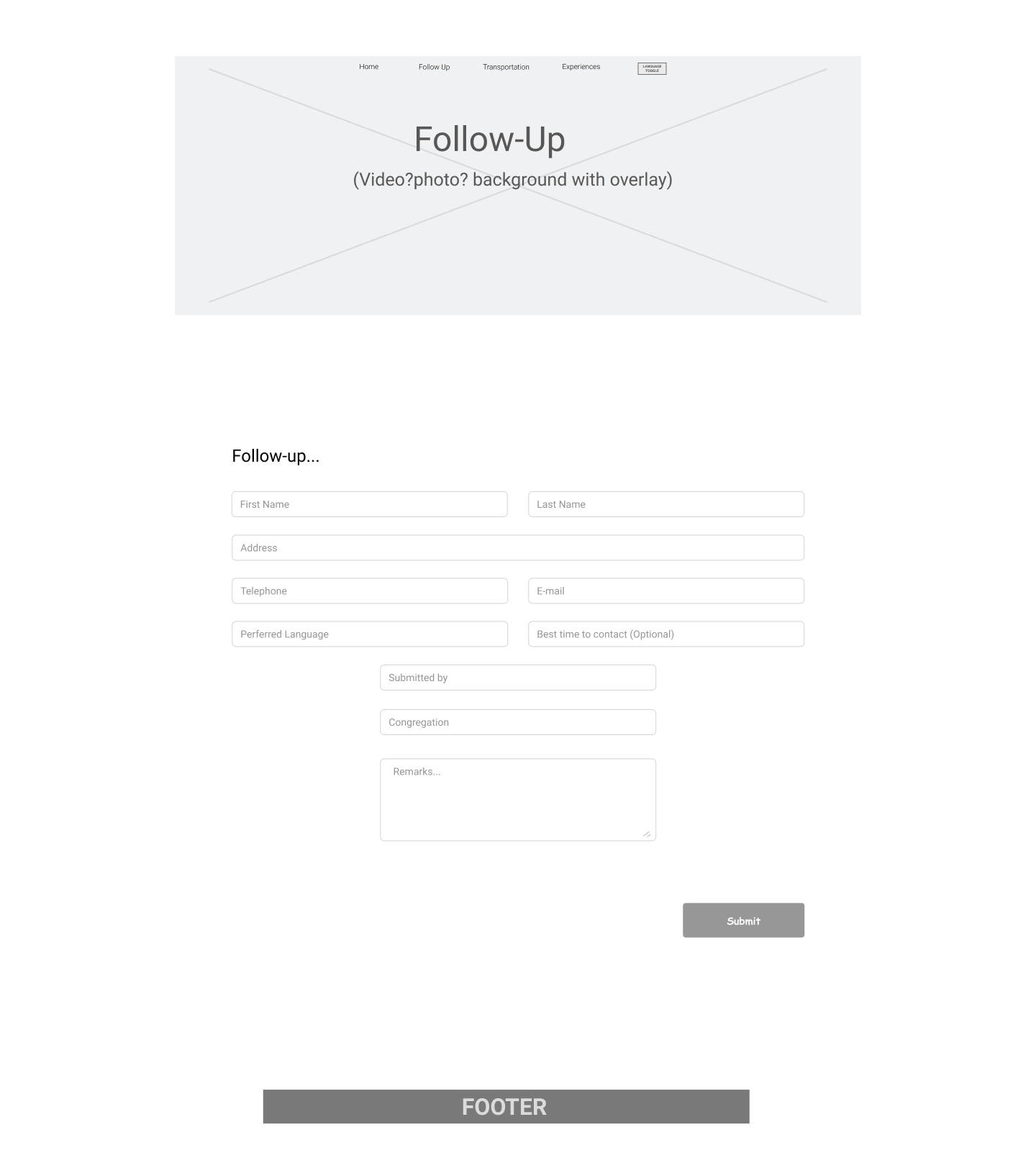
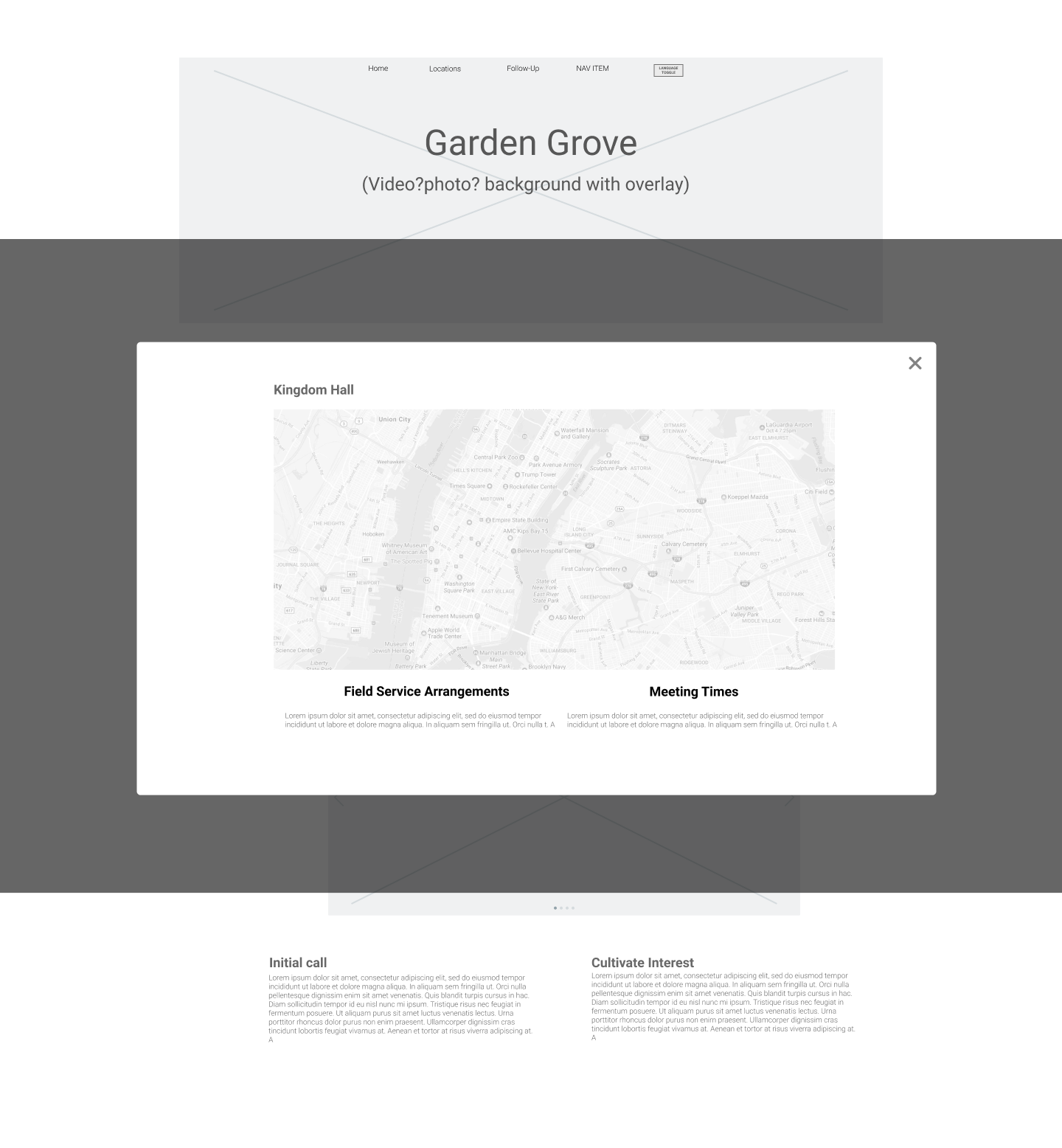
After sketching a few iterations from the user flow, I started to wireframe in Figma. The wireframes were used to create a clickable prototype to test the usability of my ideas for feasibility.

View Prototype

User Testing

When undergoing functionality testing of the low-fi prototype, testing the flow of the site. Feedback collected from testers showed no problems navigating the site. However there were a few modifications to be made.

-Add functionality to all buttons
-Input videos for homepage and pictures for about city page
-Follow-up and Experience tabs takes you to google forms, instead of seperate page
-Instead of buttons for locations and times, already have it showing on the page
-Make icons larger and clearer to read on mobile devices

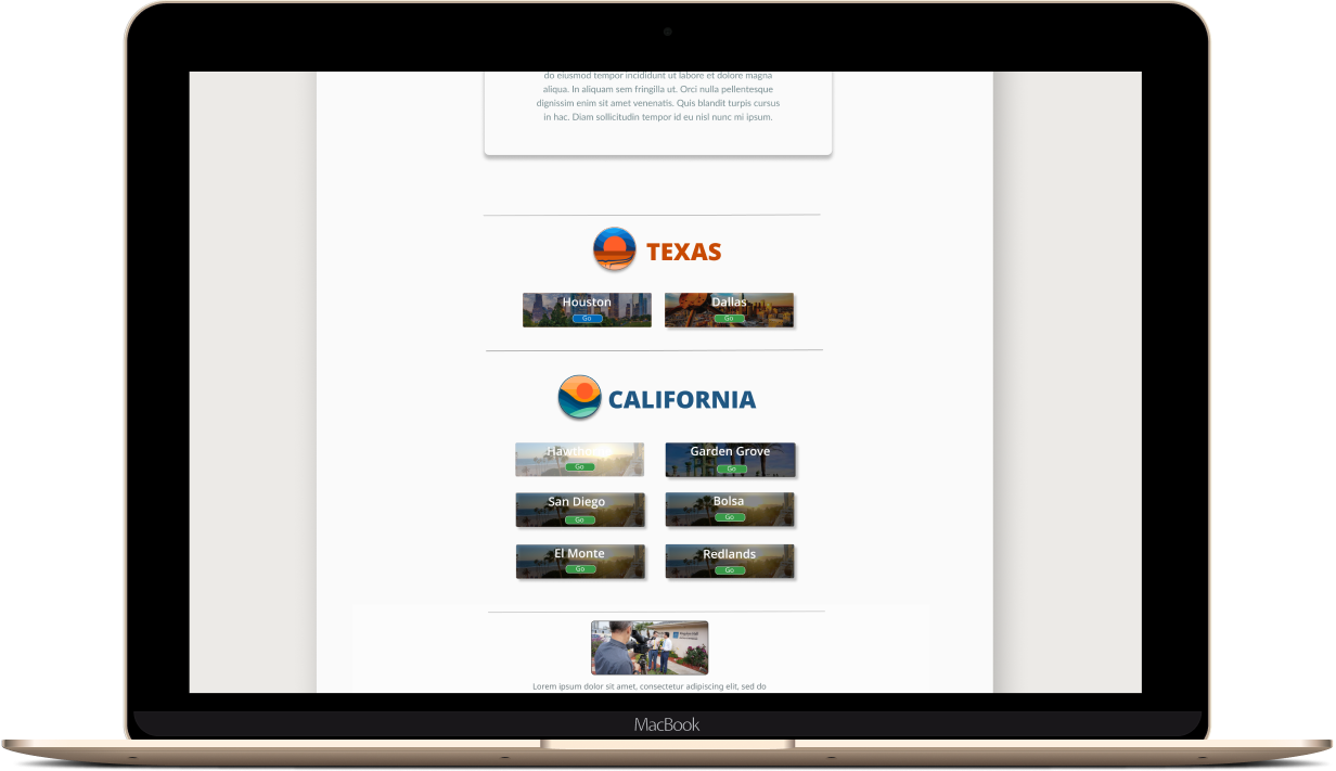
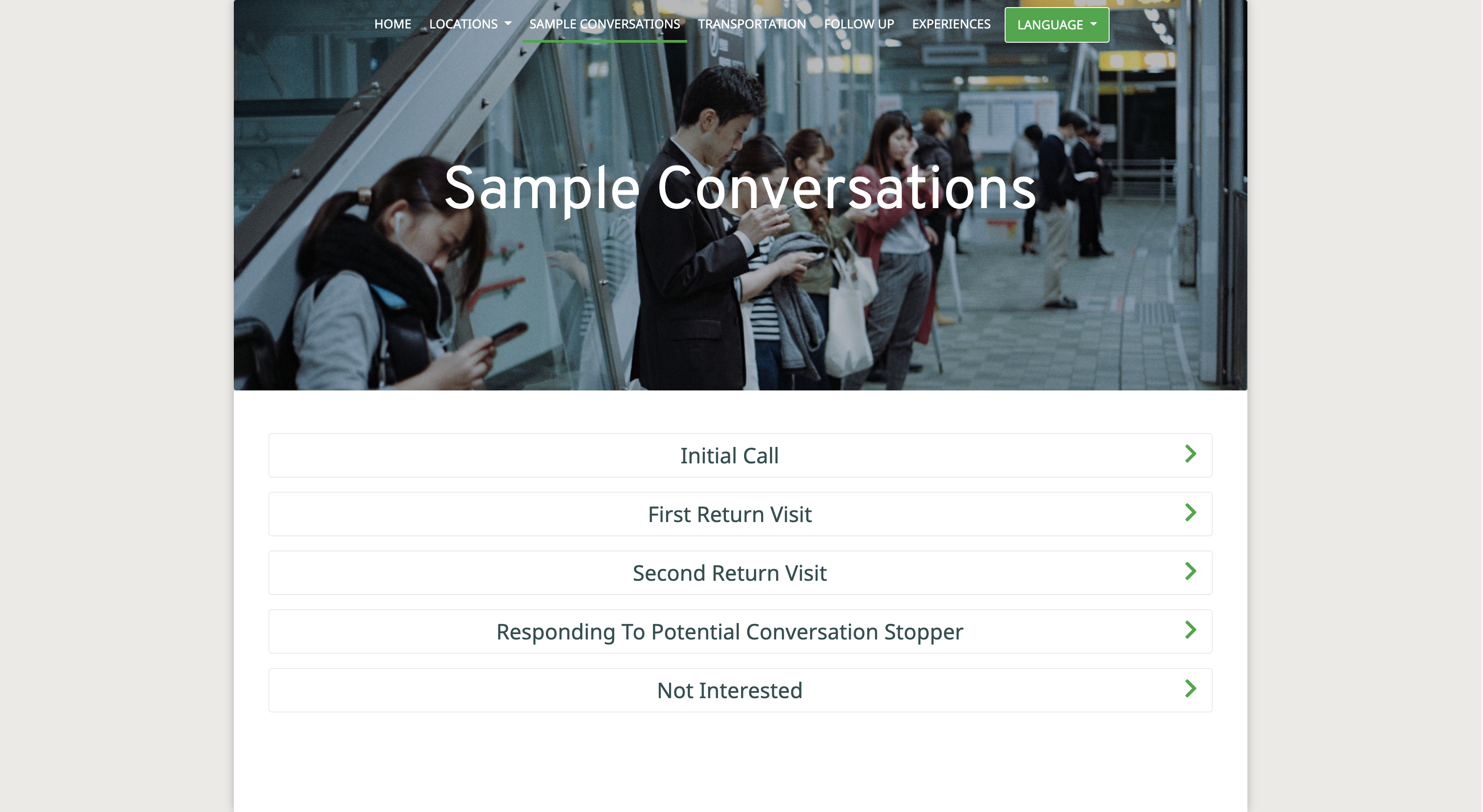
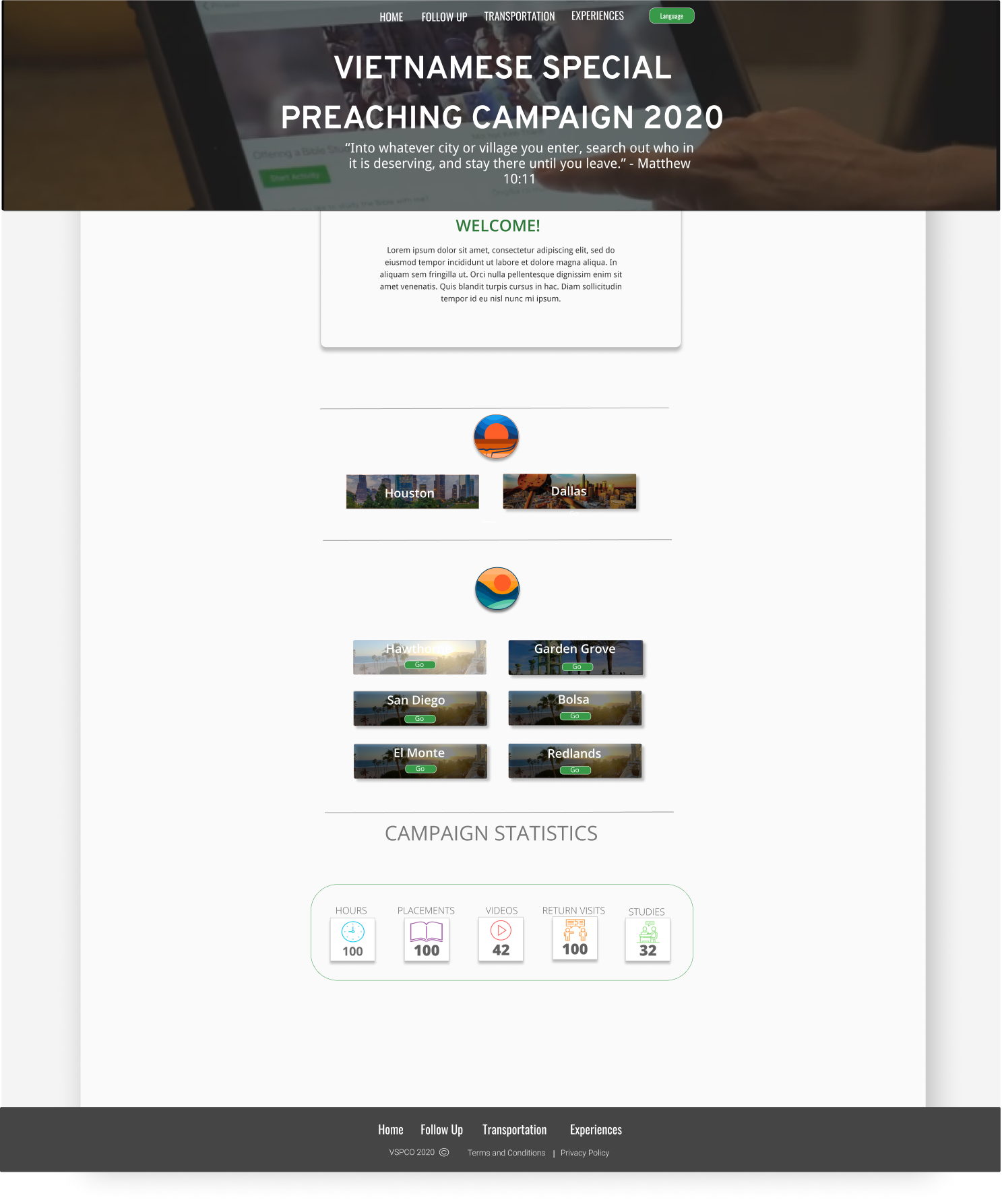
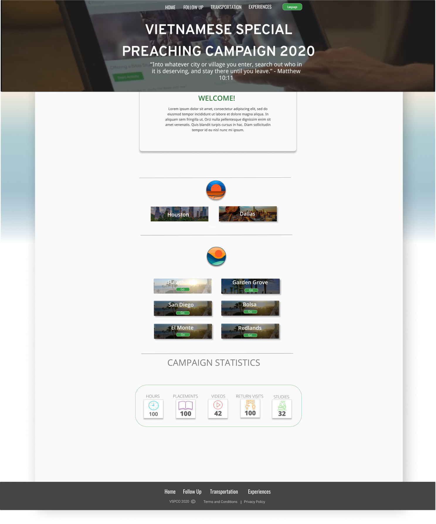
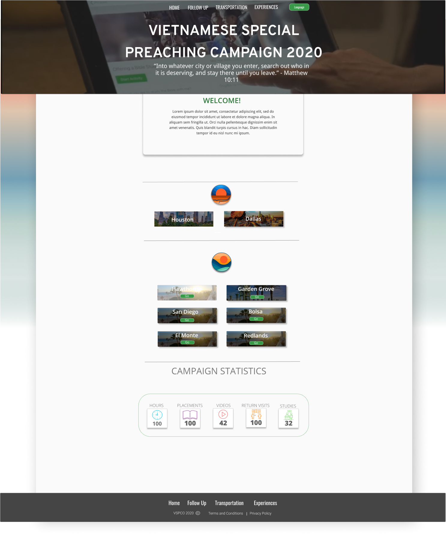
After going through feedback collected from testing and a few iterations later, here is what it looks like. The goal was always keeping a simple homepage that was easily navigatable for people of all ages. Presenting information in a way for users to easily learn on the go.

Preference Testing

To confirm and lock in my design decisions, I took it through a basic A/B test. Making sure the layout is suitable for users. After testing, the result was users liked the original white/grey background design best.

68%

17%

15%

Brand & Identity

Branding Work

This part of the process was taken care of by the graphic design team.

Final Product

At long last here is the final product!

Final Product

Conclusion

What I learned

I was very eager to start this project since this would be my official live project on a team. We wanted Vietspc.org to be simple, stylish and effective! Communicating together and brainstorming ideas was how we began this process. I am glad to say we are happy with the end product. By working with well-experienced designers, I learned so much more about UX design throughout the entirety of the project and how fast pace things can go. One minute you’re working on functions for a prototype and the next minute all the functions added are to be replaced with new ones. With all the quick iterations, it’s easy to forget the goal of designing. I believe the best goal to always have in mind is "Better User Experience!" at the end of the day isn’t that all that matters?

View Website