logo

E-Box: Being able to upload, organize and share personal files online and offline?
Yes, please! Offering a simple way to showcase, categorize, collaborate on projects.

View Prototype
Role:

UX Design
Visual Design
Branding & Identity

Design Deliverables:

User Surveys Personas
Competitive Analysis
Concept & Identity
User Stories & Flows
Paper Prototype
Wireframes
User Testing
Visual Design

Tools:

Figma
Invision
Google Surveys

Duration:

6 Weeks

Overview

What does E-box do?

Being organized is one of the most important key factors to become successful in just about anything you do. Being able to organize anything, anywhere is maybe a superpower? being able to upload, organize share personal files online and offline? Yes, please! That's why I was eager and passionate about the process of design along with the development of creating an online storage service.

Problem


In a highly saturated market already with great usability and experience with organization and collaboration, how might we design a storage system with an emphasis on organization and collaboration that is easy for users to store and showcase content?

Solution


Bringing in a new perspective. E-box has the fun flexibility of document storage, content creation, visual organization tools, powerful searchability and real-time collaboration available within one intuitive interface.

Discovery Phase

User Research

To understand what the audience needs, I created a user research survey focused on how people browsed the internet and saved content, why users used the services that they used and common likes and dislike about the current services they use.

Features do you use the most?
What are some frustrations you have experienced?

View User Survey

I summarized the data and it revealed that users were still having some frustrations from organizing to saving content. Why would big name brand services still have frustrations with their services? This is an opportunity where I can create solutions for users who still have frustrations providing a better experience for users.

User Personas

Biography

Jerry grew up fishing most of his childhood, to this day he finds peace of hearing the sounds of wildlife and running waters. He doesn’t go as often anymore since he now has a newborn child to raise and a lovely wife to take care of. He says when his newborn is old enough to walk, he will take him fishing at his favorite spot.

Goals

- To quickly categorize content for searches
- Multiple creations and uploading tools on all devices
- Quickly and easily add files on multiple platforms

Frustrations

- Features missing on some devices
- Process of editing documents on mobile
- Confusing file sharing and uploading without an account

Motivations

Jerry currently uses multiple storage platforms to store his personal and work-related files. He needs to create and access his files on his devices as he always needs to access his files where ever he is. Jerry is a very organized individual and needs all his files to be the same. Sometimes frustration occurs with the process of searching for his files.

Biography

Fiona’s dream is to travel the world. In the meantime, while she attends her state college for a degree in culinary, she takes her of her 3 kittens. Her life is busy as it gets for a student. Waking up early to prepare for the day, attending her classes and studying at night. To support herself she creates cooking tutorials on social media.

Goals

- To easily share and view groups of images and files
- Automatic file tags or suggestions
- Smoother uploading speed associated with larger files

Frustrations

- Confusing to integrate stored content with social media
- Time consuming to organize files
- Glitches when uploading bigger files

Motivations

Fiona has many recipes to try to memorize, originally everything was written down. Now she has her files on the cloud, which makes her life easier because she can simply open her tablet in the kitchen and start cooking instead of walking every looking for her papers. She is always on the look for new recipes and when she finds one online she likes to save the link to the cloud.

Competitive Analysis

Given the number of existing productivity services, I only focused my analysis on cloud storage heavyweights like Dropbox, Google Drive, and office Online. I needed to take a closer look at potential competitors to identify mainly possible opportunities I could take and how our product could provide the most value to our users. Overall, these insights into how I should go about creating and marketing.

Strengths

High user base Multi-language support
Available on multiple platforms
High awareness among internet users
Simple design & user-friendly interface
Strong financials

Weakness

Smaller space for free version compared to Google drive
Security of customers data on the cloud is still a concern

Opportunities

Rapid technological development
Opportunity to expand to new services
Increasing internet penetration and the number of smartphone users

Threats

Intense competition
Server location issues raised by few governments
Changes in consumer tastes
Availability of substitute products
Security and privacy issues

Strengths

Integration/API
Collaboration
Creating documents on the browser or mobile device
Included with Google account

Weakness

Lack of security
Offline access to Google format files only works with Chrome
A bit confusing to locate certain files in certain contexts (mobile)
Fractured experience
Only sync one folder Branding confusion

Opportunities

Organize a mobile layout to locate certain files easier
Increase the speed of uploading big files
Need of people sending files

Threats

Intense Competition
Need rapid updates of functionality

Strengths

Professional quality control over docs
Integration (Dropbox)

Weakness

No collaboration
No auto-save
Only sync one folder
Buggy file handling of MS formats
Clumsy UI (Metro-ish)

Opportunities

Implement Collaboration
Improve functionality due to bugging issues
Can improve in different routes hard to compete against big named brand

Threats

Difficult to choose this software over other well-known applications
Security and privacy issues
Intense competition

Information Archiecture

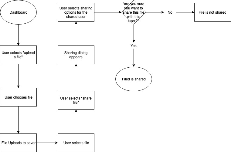
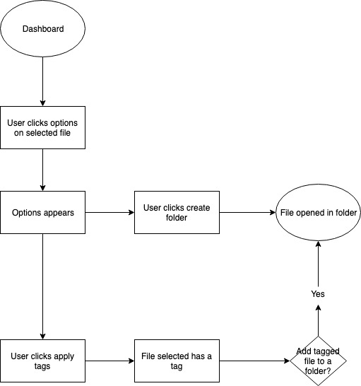
User Stories and Flows

With previous research in mind, one of the easiest ways to start the design of the smoothest paths for adding content, searching for specific items, and managing accounts. All the while having an MVP.

As a new user

I want to create an account

As a new user

I want to set my username and password

As a new user

I want to set my payment option

As a new user

I want to connect with my other accounts

As a new user

I want to configure alerts

As all users

I want to upload files( images, videos, pdf)

As all users

I want to create folders

As all users

I want to access the search bar

As all users

I want to share a folder with other users

As all users

I want to save content I find on the web

As all users

I want to browse my files

As all users

I want to create forms ( spreadsheets, etc)

As all users

I want to view my files

View User Stories

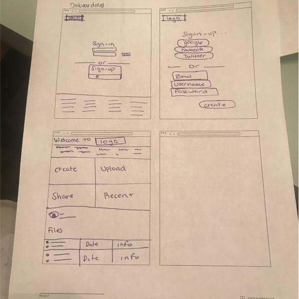
Onboarding

Uploading

Organizing

View User Flows

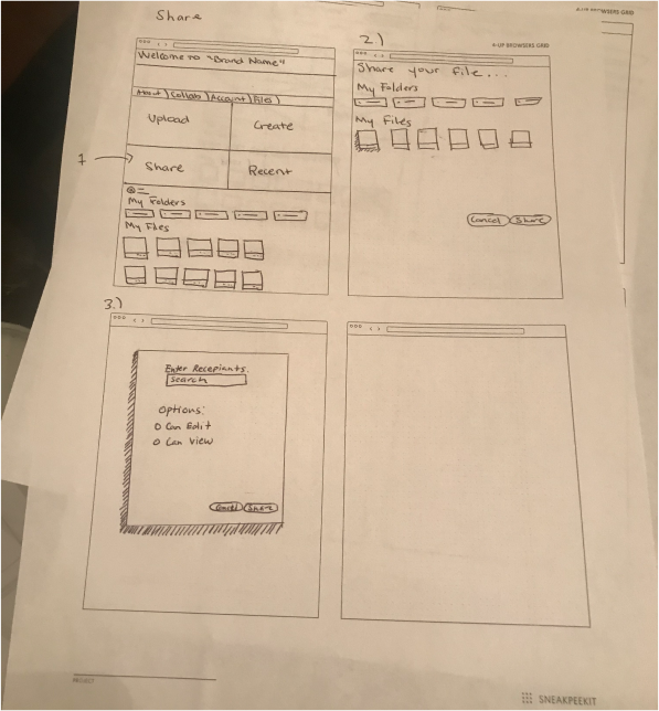
Paper and Wireframes

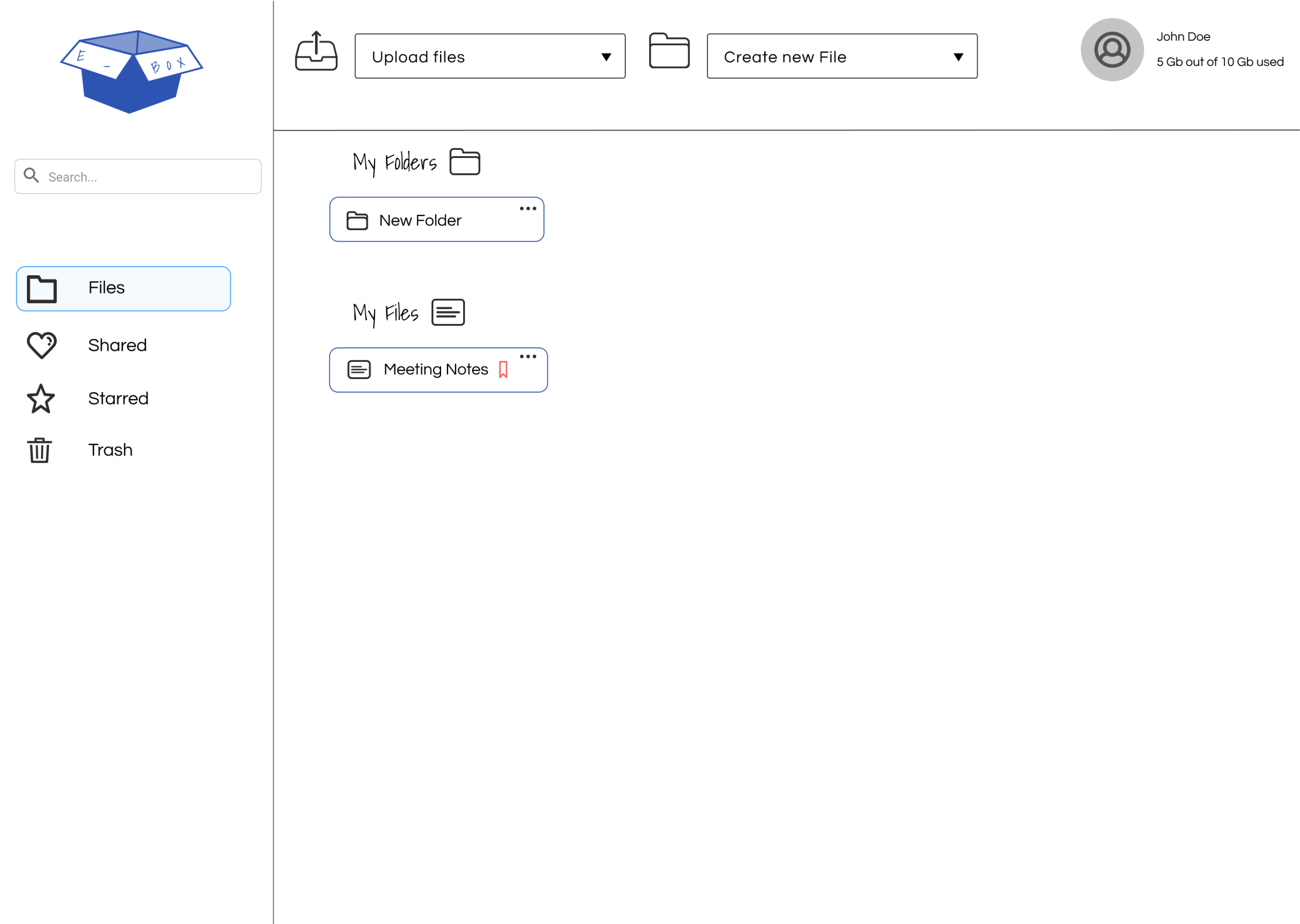
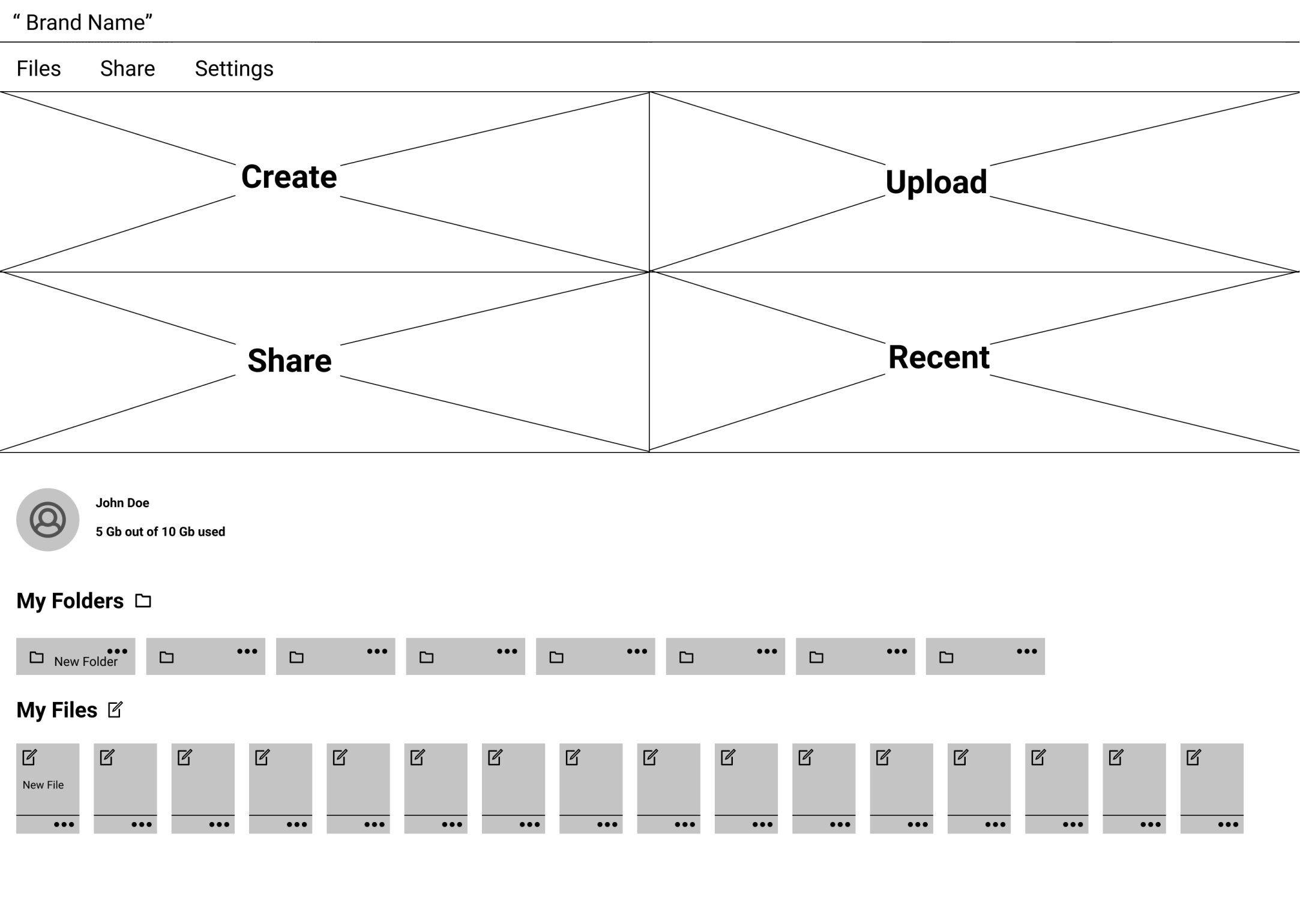
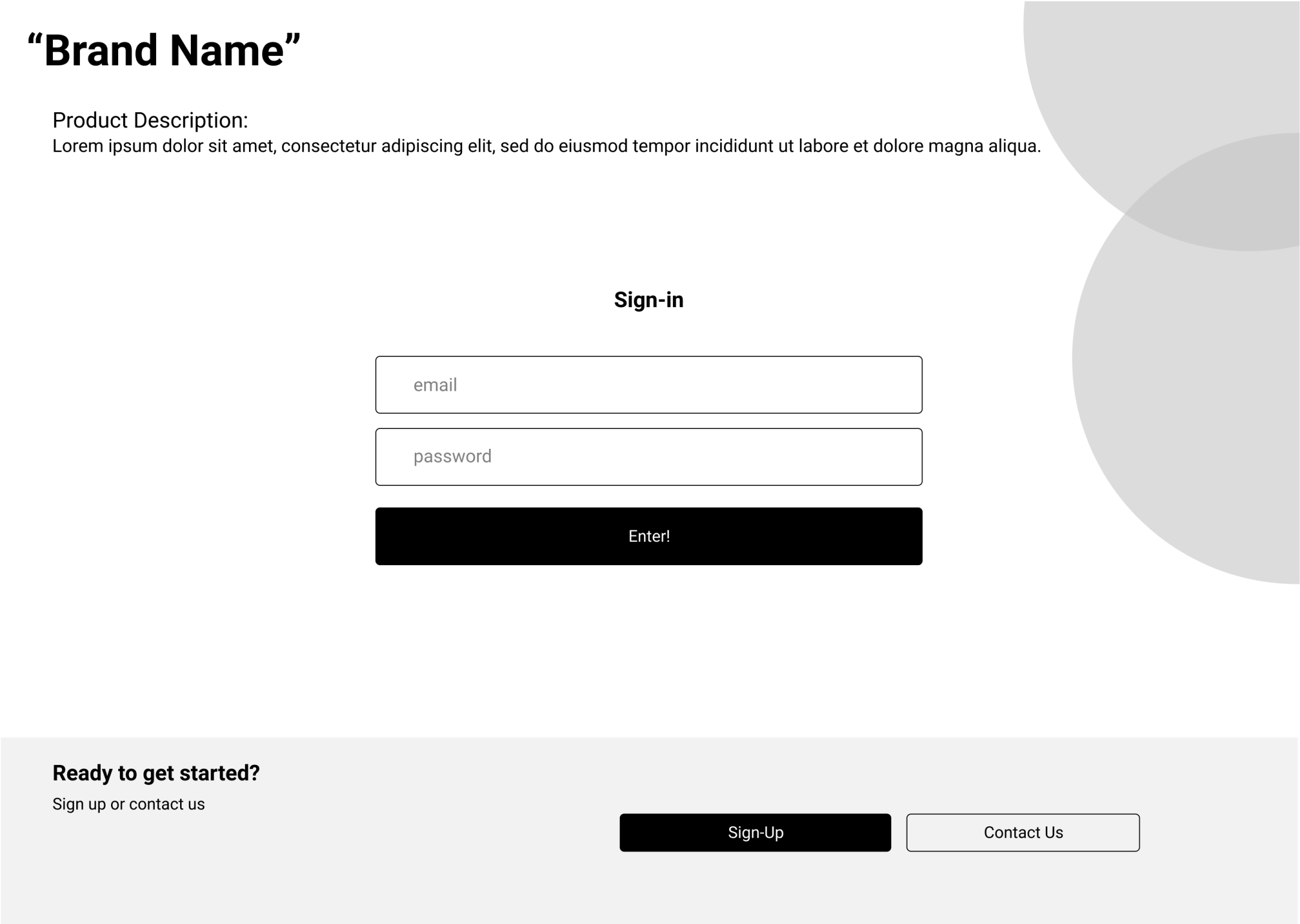
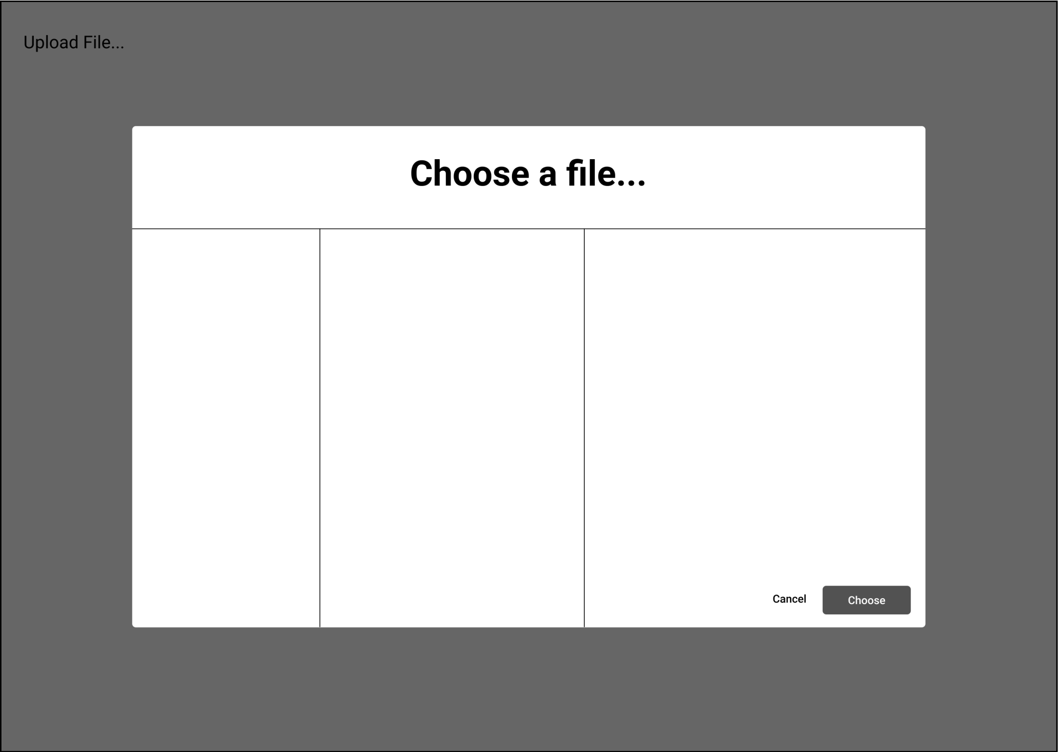
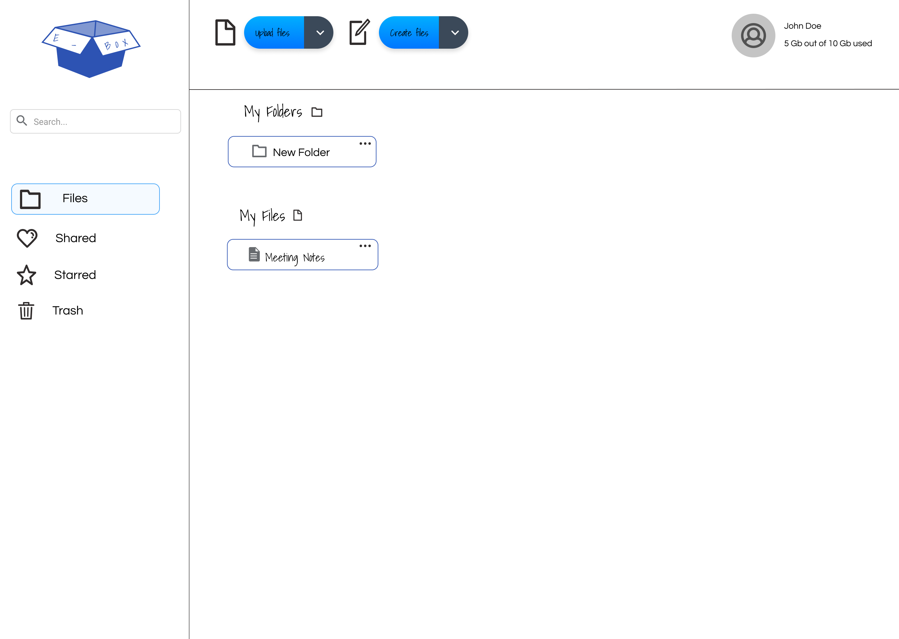
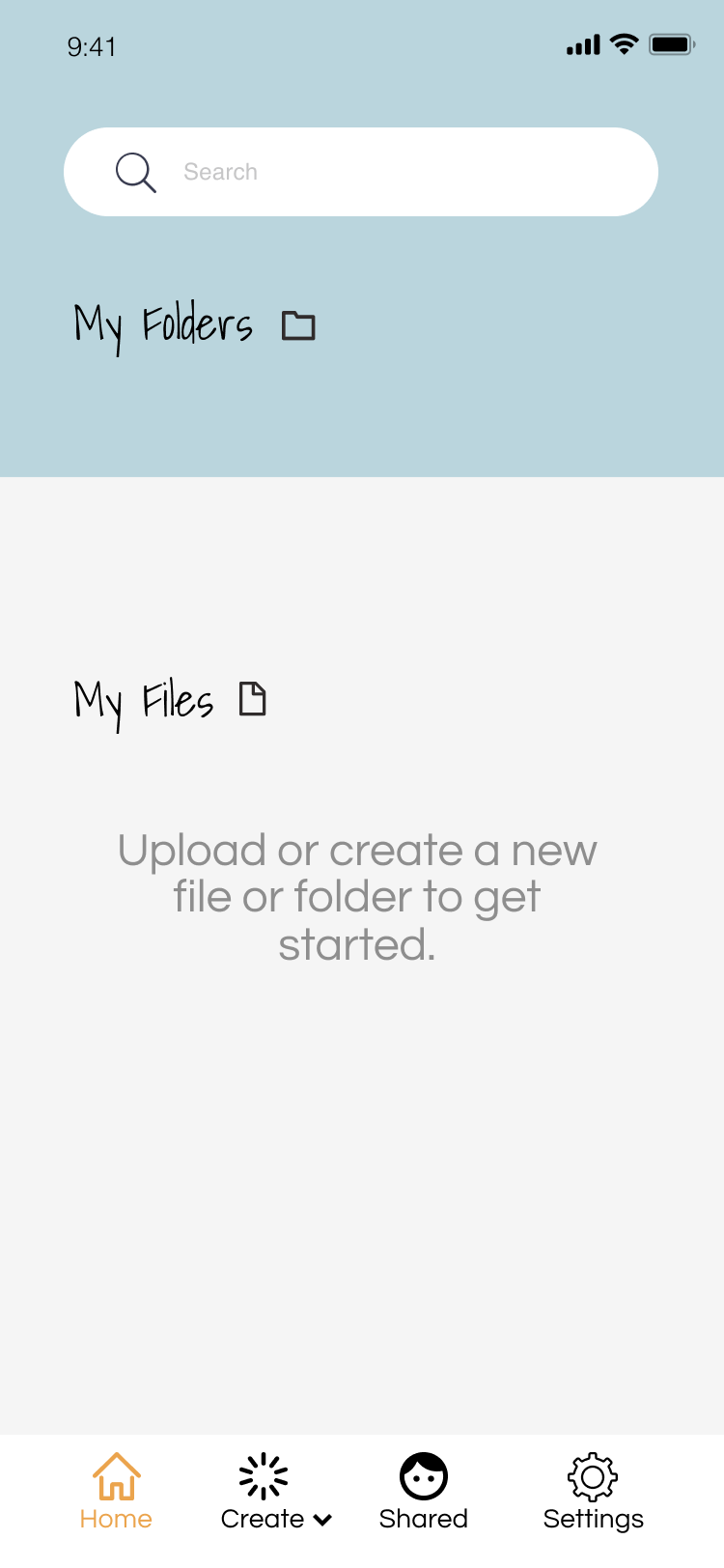
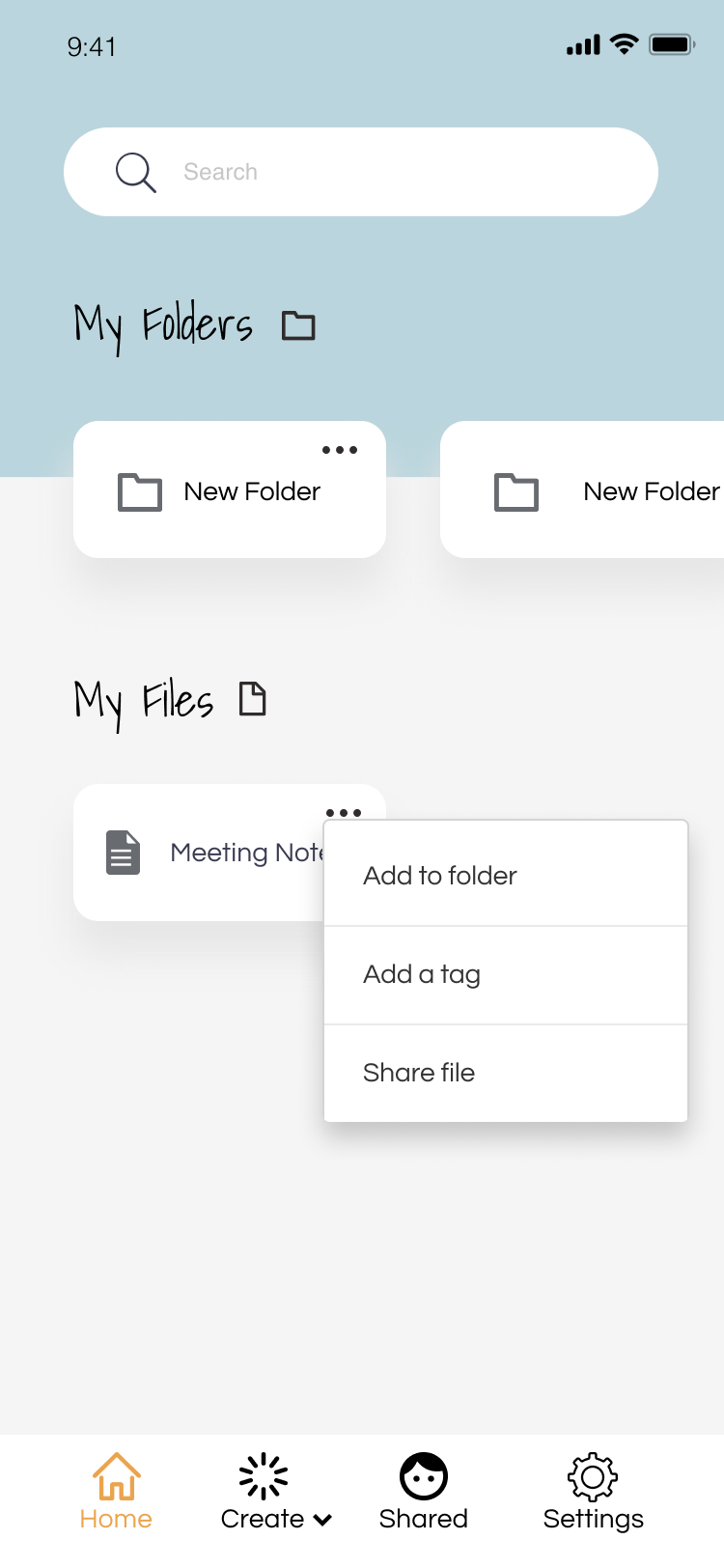
After sketching a few iterations from the user flow, I started to wireframe in Figma. The wireframes were used to create a clickable prototype to test the usability of my ideas for feasibility.

View Prototype

User Testing

When undergoing functionality testing of the low-fi prototype, specifically testing the flow of Onboarding, Uploading, Sharing and Creating. Feedback collected from testers informed me to adjust the following…

-Add functionality to all buttons
-File and share toolbar not needed
-Buttons to big/ change to icons
-Move profile to top right
-Input icons instead of big buttons

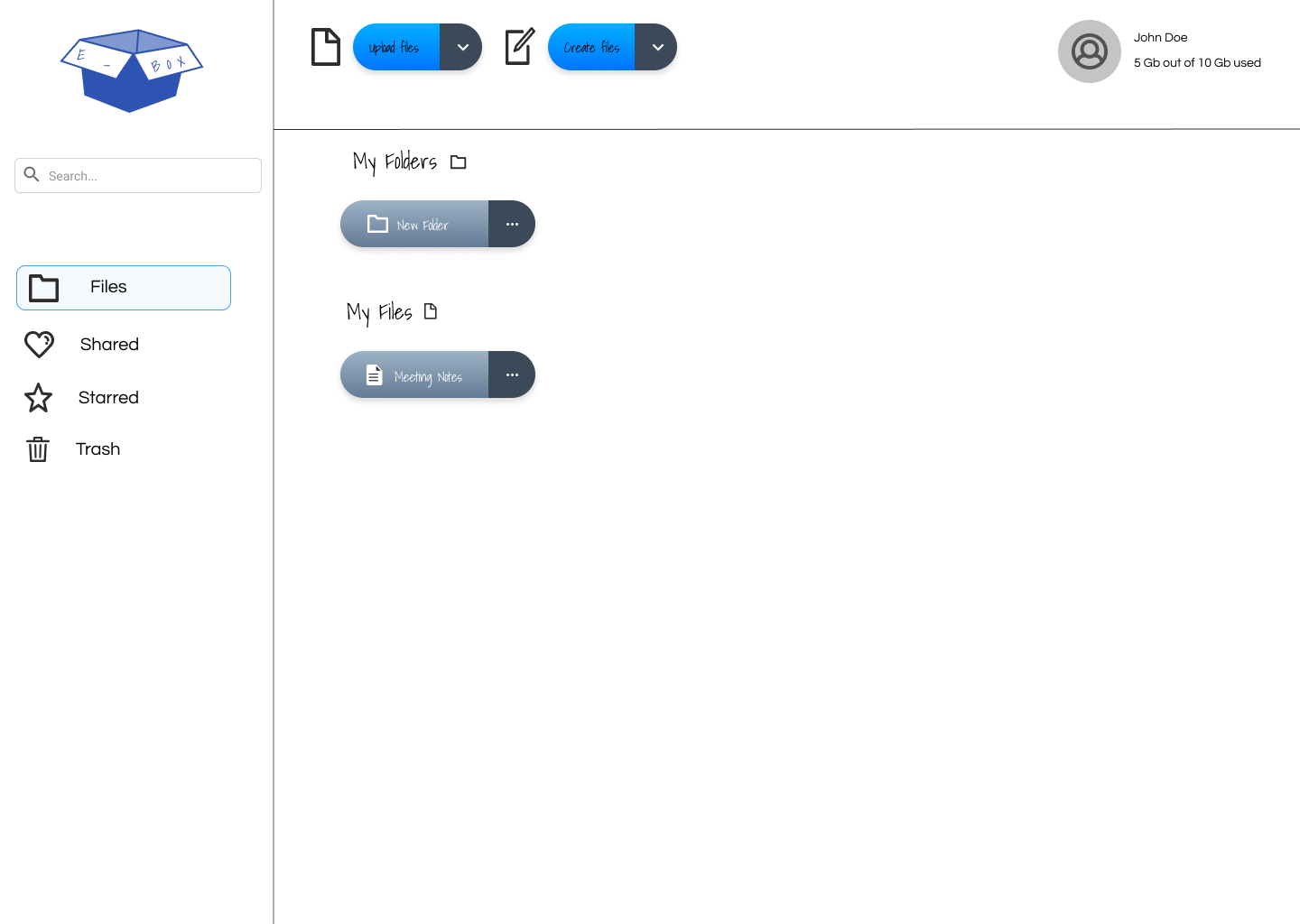
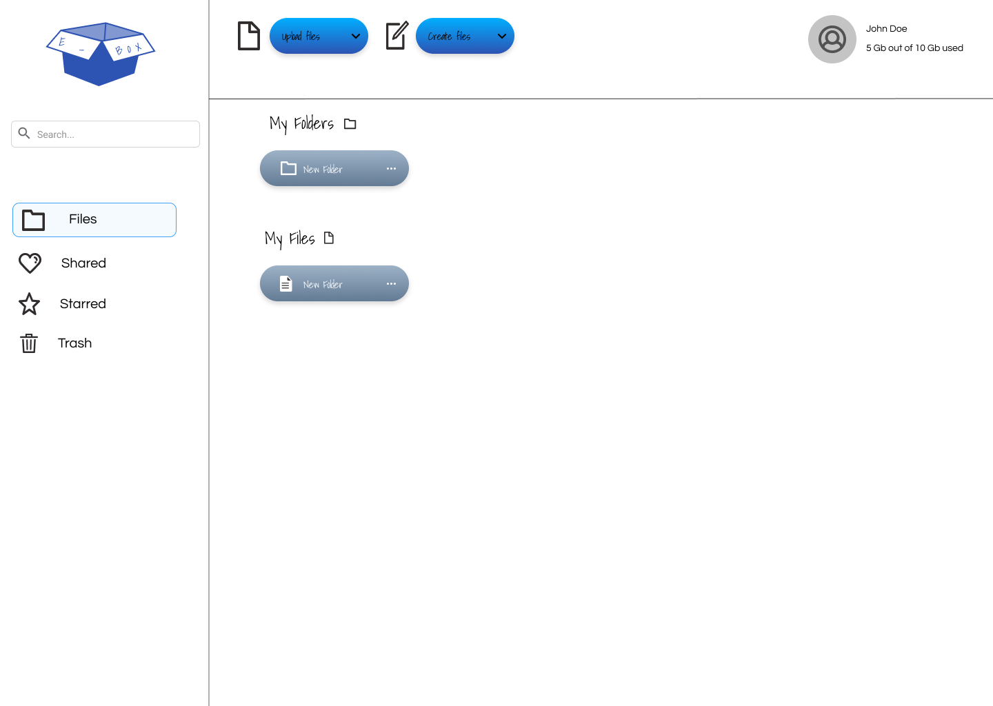
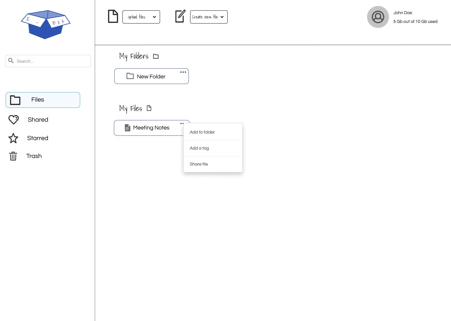
After going through feedback collected from testing and a few iterations later, here is what it looks like. The goal was always keeping a simple homepage that was easily navigatable. Along with a modern and humanistic feel. Taking a look at the refined wireframe I added all suggestions from users, such as implementing icons instead of big buttons, with a drop-down button to utilize whitespace. Added a consistent look overall with icon choices, color choice, and layout.

User Testings

Preference Testing

To confirm and lock in my design decisions, I took it through a basic A/B test. Making sure the layout is suitable for users. After testing, the result was users liked the original design best.

0%

13%

23%

Brand & Identity

Branding Work

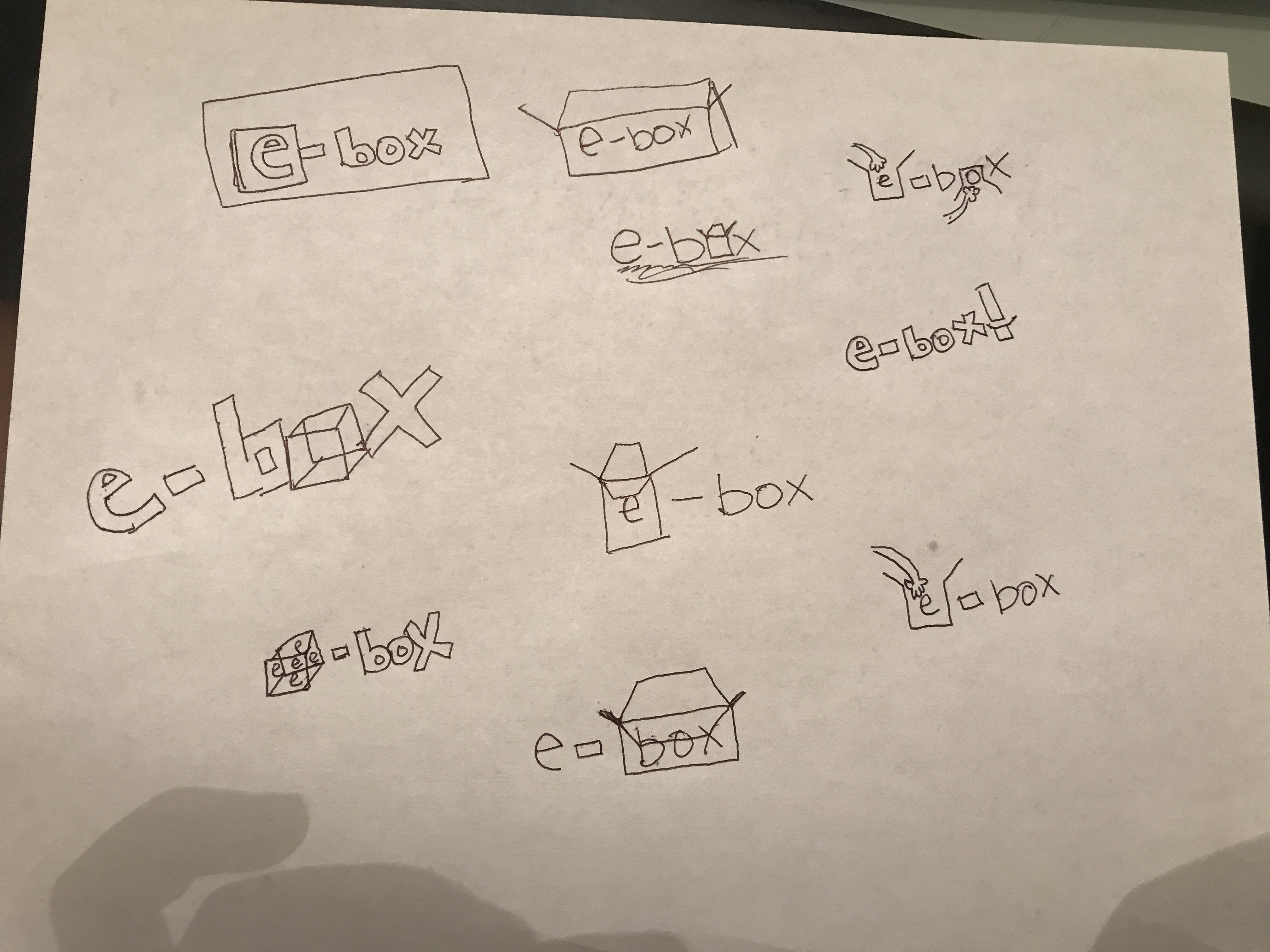
Developing the concept for the brand began with sketching and mind mapping. This process just keeps ideas to be visual on paper, snowballing for more ideas. For storage, I kept thinking of boxes as they are always used to hold or store items. Being an online service, I really kept it simple by adding an E for electronic box or E-box for short.

View Style Guide

Final Designs

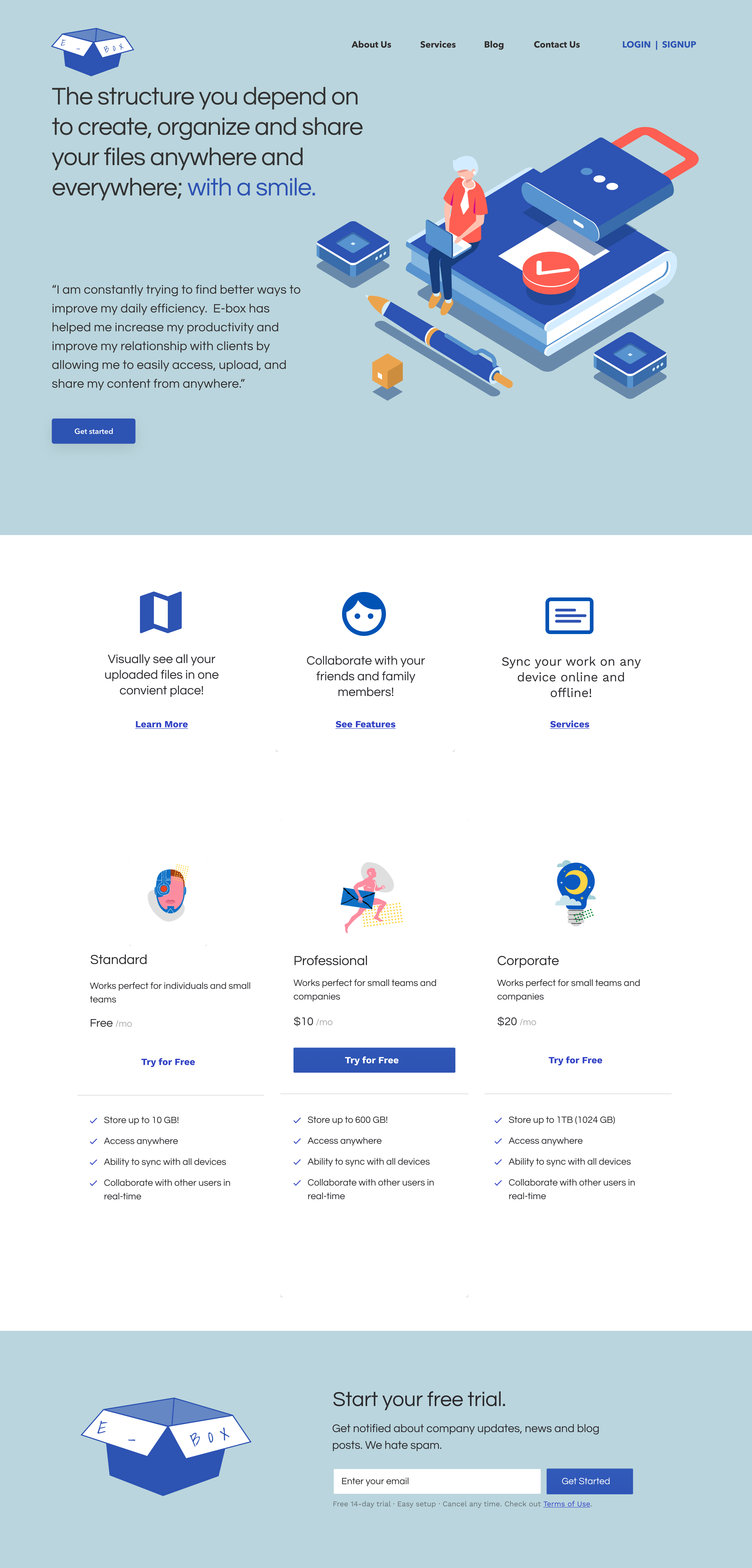
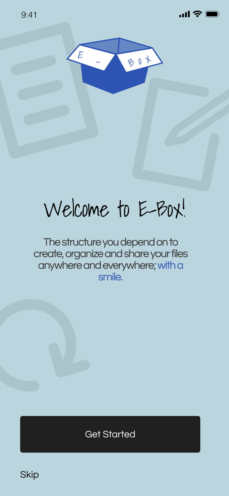
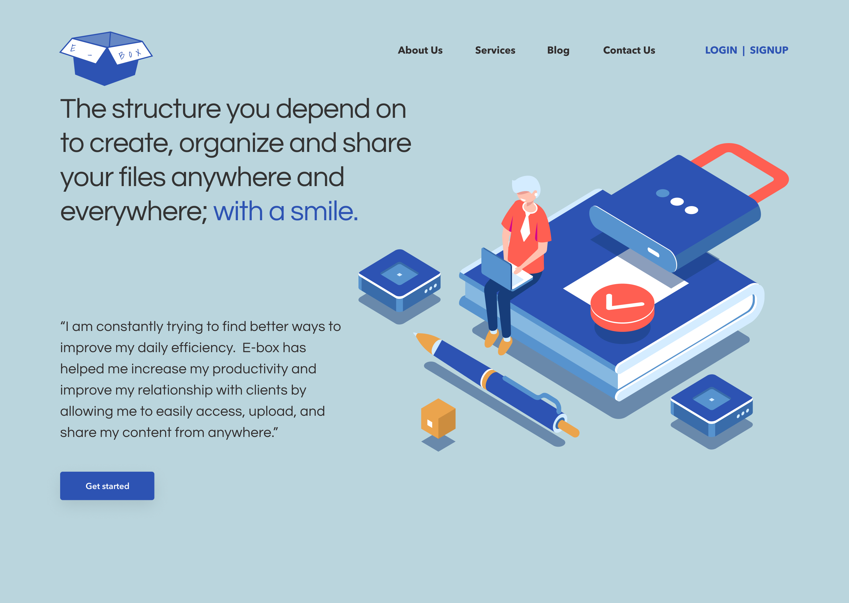
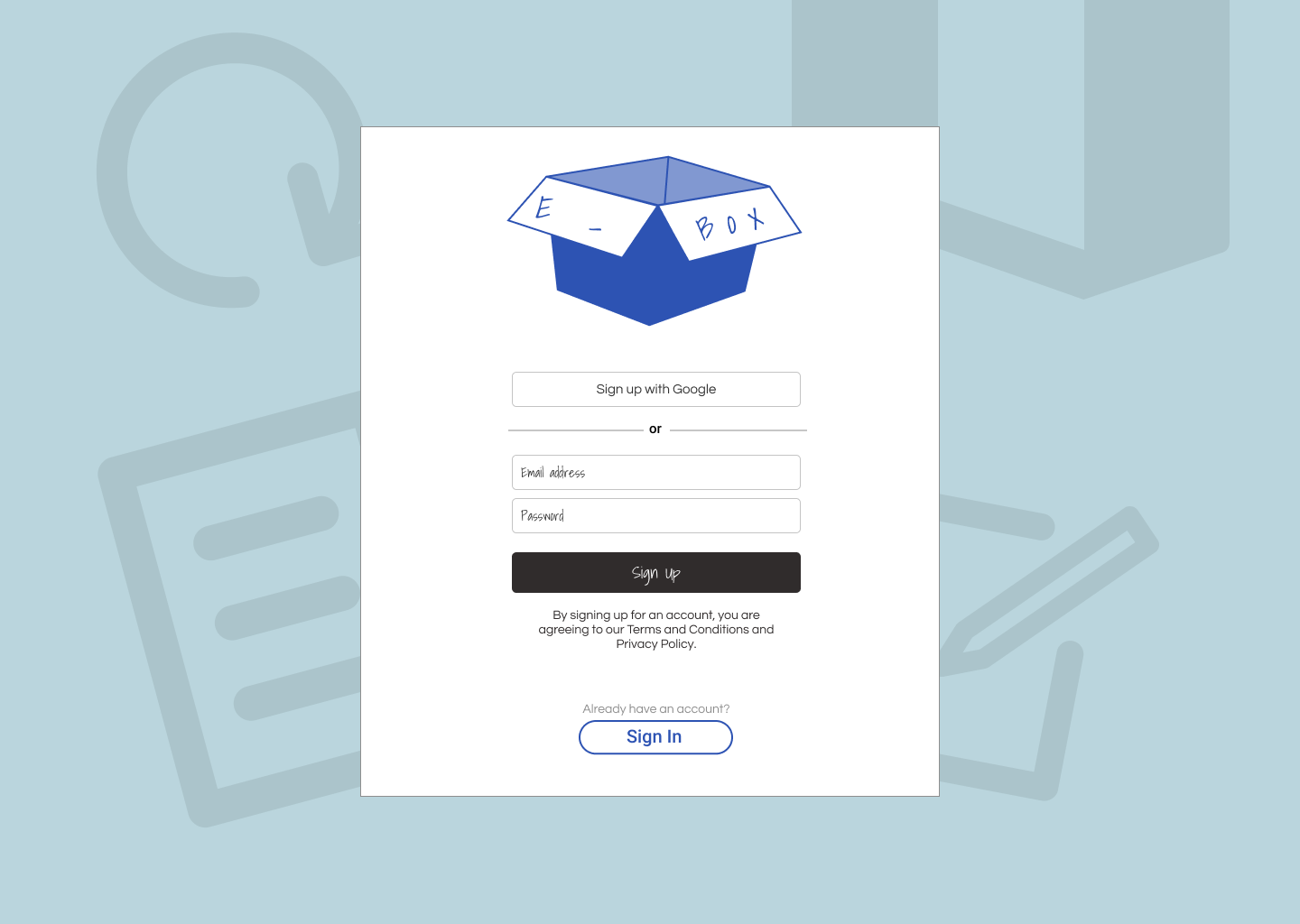
At long last here are the final designs!

Final Designs

Conclusion

What I learned

Developing e-box has given me valuable insight into the phycology behind effortlessly organizing files for users all over. If given more time, further refinements would be added to user testing and wireframes. This would allow me to attain data critical to the experience improvement for users; as well as designing a visually appealing layout. Going into the project I saw no reason to research, test, map, etc. thinking “if I like my design and it works for me why should I change it?” In the end, the design process is the greatest tool a designer has. Following the process not only helps me as a designer but also the design solution that came out of it to create a better user experience. I find the process not restricting but channels your ideas out visually with convenient steps to ensure you have everything need.

View Prototype